Supply Chain Mapping Tool
Watch the latest webinar of the *NEW and IMPROVED* tutorial!
Make sure to unmute and turn sound up!
New & Improved Supply Chain Mapping Tool at the Fall Coyote Business Consulting (CBC)


Original Supply Chain Mapping Tool at the Spring Coyote Business Consulting (CBC) Showcase


Coyote Business Consulting Spring Showcase Event Produces Impressive Mapping Platform for Manufacturers
This tool was developed through a partnership with Coyote Business Consulting and presented at the 2025 South Dakota Supply Chain Symposium.
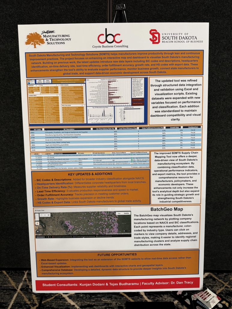
Step 1 – Dashboard Overview
This dashboard presents data collected from D & B Hoovers and includes companies with NAICS codes starting with 31, 32, 33 It provides a visual way to explore manufacturing supply chain information across the state of South Dakota. It includes interactive tables, slicers, and action buttons designed for usability.
Step 2 – Filtering by Number of Employees
To begin exploring the data, you can filter by number of employees using the slicer labeled ‘Employee Count.’ This allows you to quickly identify companies based on workforce size, which can be useful when targeting small, medium, or large manufacturers.
Step 3 – Filtering by Company Name
You can also filter by a specific company name using the ‘Company Name’ slicer. This is especially helpful if you are looking for a known business and want to isolate its record from the full list.
Step 4 – Filtering by City
The ‘City’ slicer allows you to narrow the results by geographic location. Selecting one or more cities updates the dashboard to reflect only companies located in those areas.
Step 5 – Filtering by NAICS Industry
The NAICS Industry slicer lets you explore companies grouped by industry category. This aligns with the first three digits of the NAICS code, helping you quickly see broad sector-level trends.
Step 6 – Filtering by NAICS Description
For a more detailed view, use the NAICS Description slicer to filter by the full industry classification. This provides a deeper look into specific capabilities, such as metal fabrication or plastics manufacturing.
Step 7 – Viewing the Filtered Company List
The filtered results appear in the main company table. You can view or copy this list to create a customized report based on your selected filters.
Step 8 – City-Based Visuals and Informational Charts
The dashboard also includes visual insights related to geographic distribution. Two informational charts — ‘Top 15 Manufacturing Cities’ and ‘Suppliers by City’ — highlight areas with high concentrations of manufacturing activity. These charts do not update with slicers, but offer helpful context to support statewide supply chain visibility.
Step 9 – Suppliers by NAICS Industry Chart
The ‘Suppliers by NAICS Industry’ chart, however, is interactive. It updates dynamically when you apply filters. This allows you to quickly assess the types of industries represented within a city or cities.
Step 10 – Verify Business Button
Click the Verify Business button to cross-check selected companies against additional public sources. This tool is helpful for confirming operational status, updating contact details, or flagging duplicate entries.
Step 11 – Company Detail Lookup
To view detailed information on a specific company, use the dropdown in cell F4. Select a company name, and a form will appear showing address, phone number, website, NAICS code, and more.
Step 12 – Resetting Filters
To reset your selections, use the clear filter icons in the slicers. This restores the full data view.
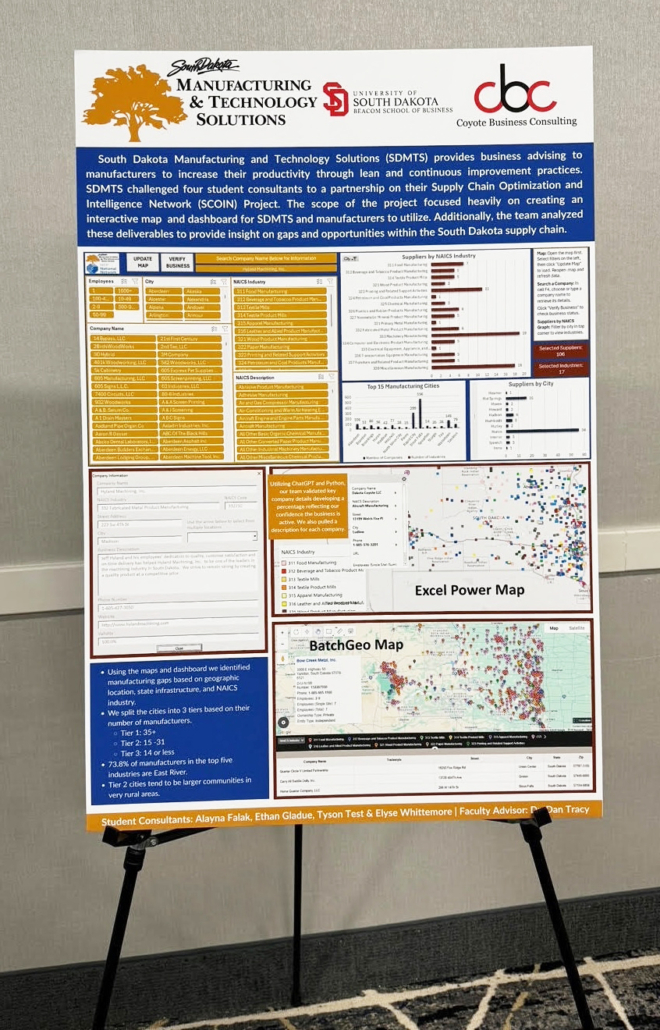
Step 13 – Batch Geo Map Button
To view a map of the filtered companies, click the Batch Geo Map button. This launches a browser-based map that plots the companies based on their addresses. The map reflects your slicer selections — for example, you can view only suppliers with 50–99 employees or only companies in the paper manufacturing sector.
Once the map loads, you can click on individual pins or on a company name in the list below the map to view each company’s name, address, and business description. This is especially useful for route planning, supplier research, or visualizing industry clusters within a region.
Step 14 – Excel 3D Map Button
You can also use the Excel 3D Map feature by selecting Alt + Q, searching “3D Map,” and clicking “Open” It will then open an interactive map visualization directly within Excel. This tool lets you explore company locations across a 3D map with the ability to filter on any of the fields listed in the field list. NAICS Industry, NAICS Description, Employees and City filters are already available. To add additional filters, use the Add Filter feature. The 3D map allows you to zoom in and view individual company data.